Below are some magazine adverts for albums of bands in a similar genre to mine. I have analysed each of them, compared them to the band's album cover, and made a list of common features which occur in most, if not all, of the adverts. I will make another post in the next week with my magazine advert and how I have incorporated these features into my advert.
 |
| The album cover |
 |
| The magazine advert |
The typography on the magazine advert is the same as the
album, as everything on the advert is written in the same font, and the advert
features exactly the same background as the album. The name and logo of the
band’s record label / management is at the bottom of the advert as well as the
album cover.
The album name is the focus of the advert, just like the
album cover, and the extremely bright, eye-catching colours make it hard to
ignore. The advert includes a pre-order offer at the bottom; you get their new
single free if you pre-order the album, which is attractive to fans of the
band, and it guarantees album sales by making sure they pre-order.
The advert mentions the names of the bands' biggest singles
from the album, so people who aren't necessarily fans of the band but like one
of their new singles, may be more likely to buy the album if they see that the
song is on the album.
The consistency of the style of the advert and the album
cover makes it easy for people to associate them with each other, and therefore
they can immediately link them together.
 |
| The magazine advert |
The name of the band and the title of the album are in the
largest font, making them more eye catching and stand out more. The release
date of the album is towards the bottom of the advert; this is put on to get
the fans excited about the album coming out, and give enough time for
word-of-mouth to take effect.
The pre-ordering of their new album also features the offer
that you will have access to “exclusive footage” of the band, which,
assumingly, no one else will have. This makes it appealing to fans because they
will want to be the first to have exclusive access to this footage, and so are
more likely to pre-order the album.
 |
| The album cover |
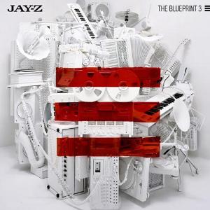
The picture on the magazine advert is exactly the same as that on the front cover of the album, making them both immediately recognisable to fans of the artist, but also so that, when the album comes out, people will hopefully recognise it from the advert. The typography is also the same as that on the album, which keeps continuity. Alike the other adverts, this one features the release date of the album, names two of the album's biggest singles, the artist's website, and the name of the label he is signed to, which can attract new people to listen to his album because they trust the record label to sign only the best artists. Furthermore, most of the items in the picture feature in the video for the single 'D.O.A. (Death Of Autotune), again, making the album cover and magazine advert instantly recognisable to anyone who has seen the music video and liked the song.
Common Features:
- The same picture that is on the album cover is used for the background of the advert
- The release date of the album
- The same typography as the album is used
- Either the artist's name or the name of the album is the main focus of the advert
- They have the logo of their record label / management at the bottom of the advert
- They name a few singles which are on the album


No comments:
Post a Comment